
Qualtrics | Reporting & Analytics (RAP)
UX Design
AI-Workflows
Prototyping
Concept Testing
Internship
My Role
UX Design Intern
Tools
Figma, Subframe, Lovable
Timeline
June – Sept 2025
Team
RAP UX Team, Product Managers, Software Engineers
Overview
What is the Reporting & Analytics Platform?
The Reporting & Analytics Platform is what powers Qualtrics dashboards, reports, and interactive widgets, the tools customers use to explore their data and share findings with stakeholders. My internship zeroed in on one moment: the first few minutes after a brand-new customer opens the dashboard builder.
The Problem
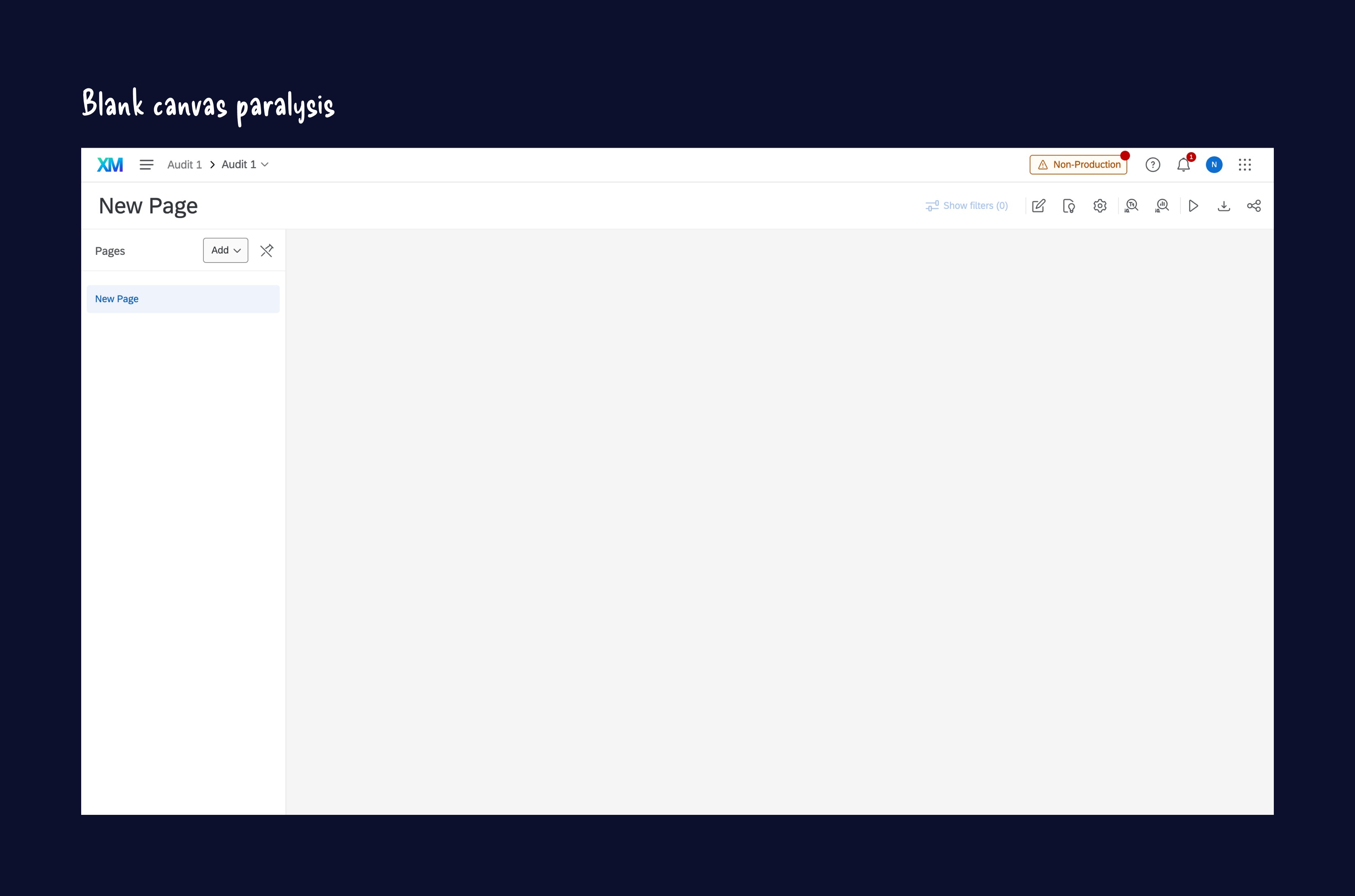
There’s a real drop-off right before the first widget
Customers were landing on a blank screen with zero guidance, falling into trial and error to pick a widget, and getting tripped up by messy data that led to broken visualizations. The goal was a clearer path to that first widget, faster and with more confidence.
Research & Discovery
Synthesizing everything the team already knew
Before sketching anything new, I pulled together past research from across the team and mapped the entire dashboard creation journey end to end. That map is what surfaced the real pain points, and where the biggest opportunities were hiding.
Ideation
Looking outward before going wide
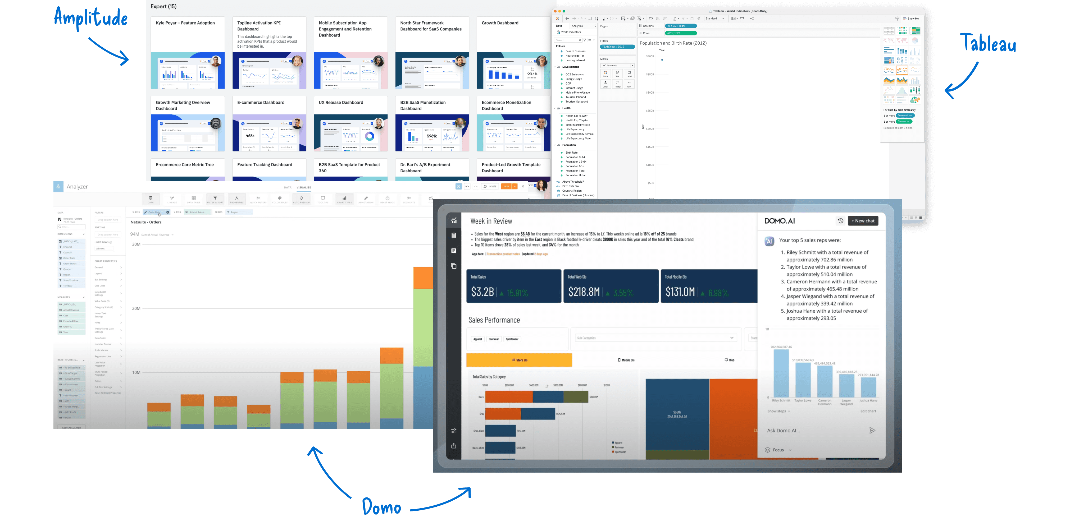
I looked across seven competitors to see how other tools handle widget selection and setup. Then, with no constraints on what engineering could actually build, I ideated over 50 potential solutions to test against what research had surfaced.

Prioritization & Prototyping
Two directions, three prototypes
The simple track meant widget search, clearer context at each decision point, and locking fields until prerequisites were met. The north-star track explored pre-made templates and AI-driven suggestions for people starting from a blank slate.

Testing & Iteration
Putting it in front of 9 first-timers
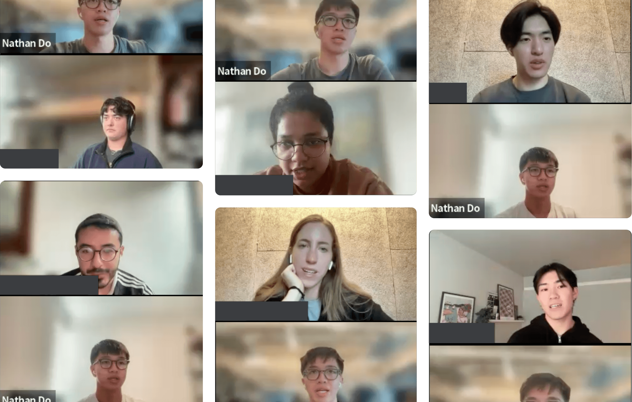
I concept tested three prototypes with 9 people who’d never built a dashboard before, to see how much they trusted each direction and whether they’d actually use it. AI-supported dashboards won out for feeling familiar and efficient, though people wanted to see the reasoning behind a suggestion before trusting it.
Impact & Outcomes
Where it landed
The short-term wins, progressive field unlocking, widget previews, clearer error messaging, moved straight into the roadmap. On the north-star side, 88% of participants preferred the AI-supported approach and 100% found the hover previews helpful, enough to justify scoping a working prototype.
Short-Term
The short-term recommendations were grounded in research and shared with the team to inform ongoing design work. One set of findings was used directly by another designer, while the remaining recommendations prompted collaboration between design, product, and engineering to assess feasibility and effort.
North Star
The north-star concept extended beyond near-term improvements. A product manager proposed creating an engineering proof of concept to explore its potential and support future investment discussions, helping move the idea from exploration toward validation.
Reflection
What I’d take with me
The biggest shift for me was realizing how much documentation actually mattered, not for its own sake, but because it’s what kept design, PM, and engineering in sync as the project moved. Watching 9 people get stuck in real time taught me more than another round of Figma iterations ever could.