Capitol Hill Tool Library
UX Design
Workflow Optimization
Mobile-First Design
Information Architecture
Usability Testing
Role
UX Designer
Tools
Figma, Lovable
Timeline
Jan 2026 – Jun 2026
Team
Luke Jin, Vy Nguyen, Ji Min Sung, Yoobin Lee
Overview
What is CHTL?
The Capitol Hill Tool Library is a nonprofit community tool lending organization in Seattle where volunteers manage inventory, member accounts, and tool transactions during active shifts. The existing system created usability challenges that slowed volunteers down and increased reliance on staff support.
The Problem
During shifts, the existing system slowed volunteers down
Through interviews, contextual inquiry, surveys, and usability testing, we found high cognitive load, inefficient workflows, poor findability, weak onboarding, and a system that wasn’t built mobile-first.

Framing the Challenge
How might we help volunteers move faster?
Therefore we asked: how might we enable volunteers, new and experienced, to complete check-in, check-out, and inventory tasks quickly and accurately with minimal staff support?
Ideation
We focused on the workflows volunteers used most often
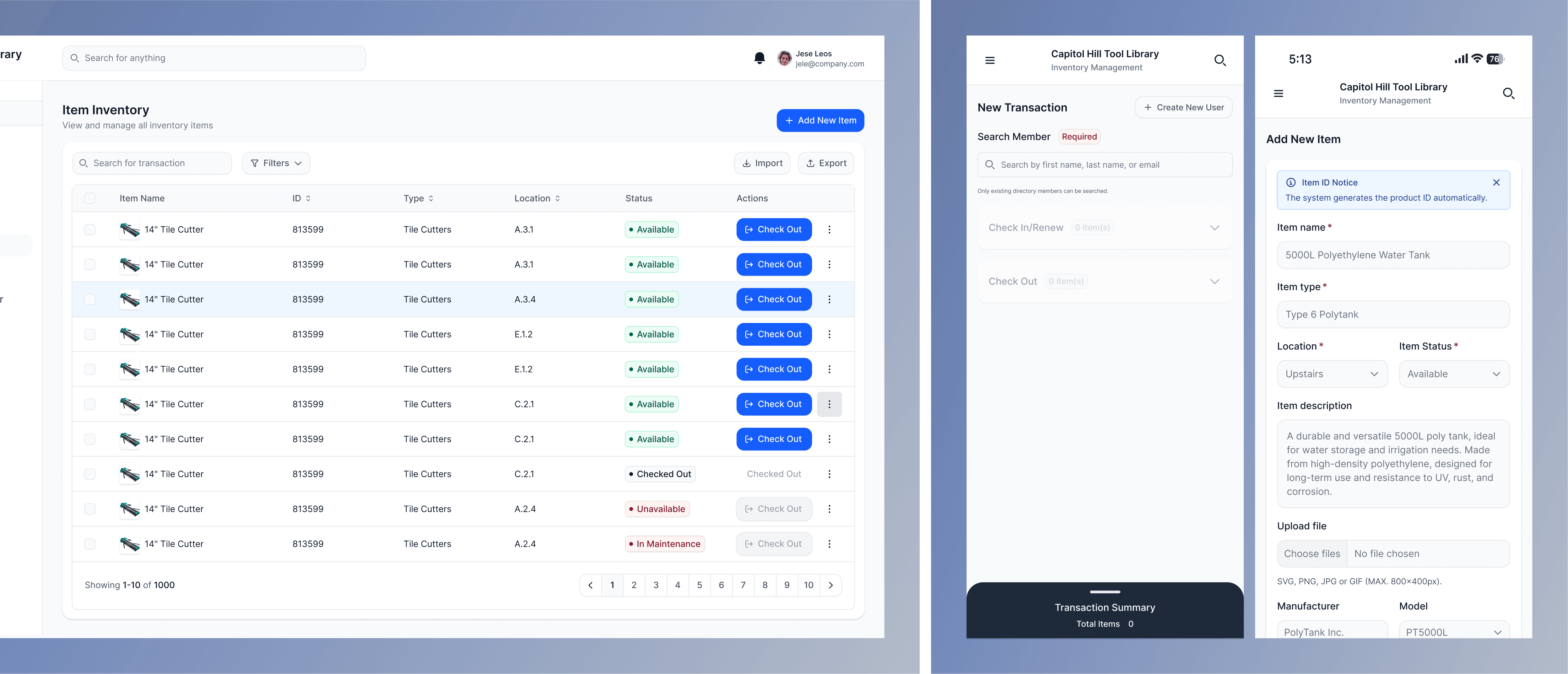
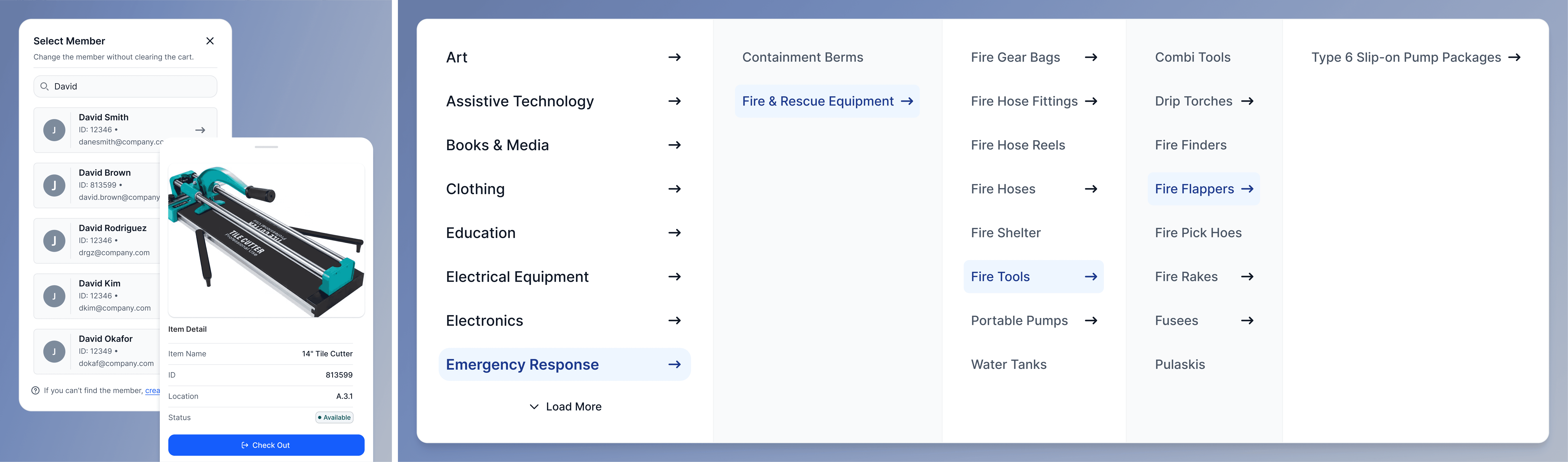
Check-In, Check-Out, Renewals, Inventory Search, and Member Management, the five workflows volunteers relied on most during every shift.
Prioritization & Prototyping
Redesigning check-in and check-out
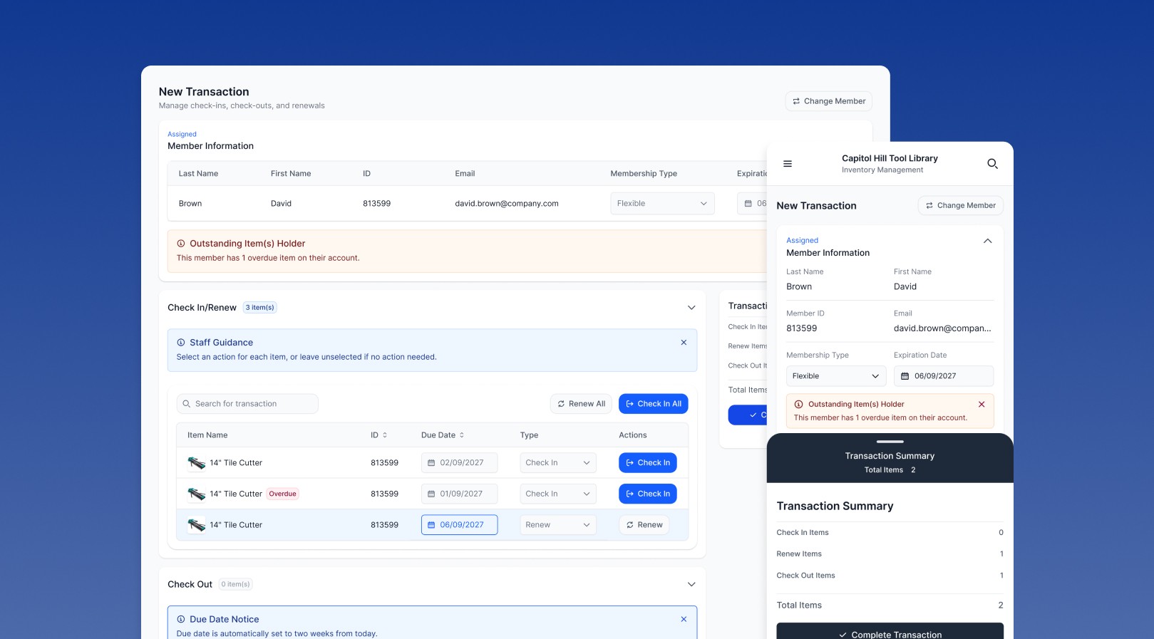
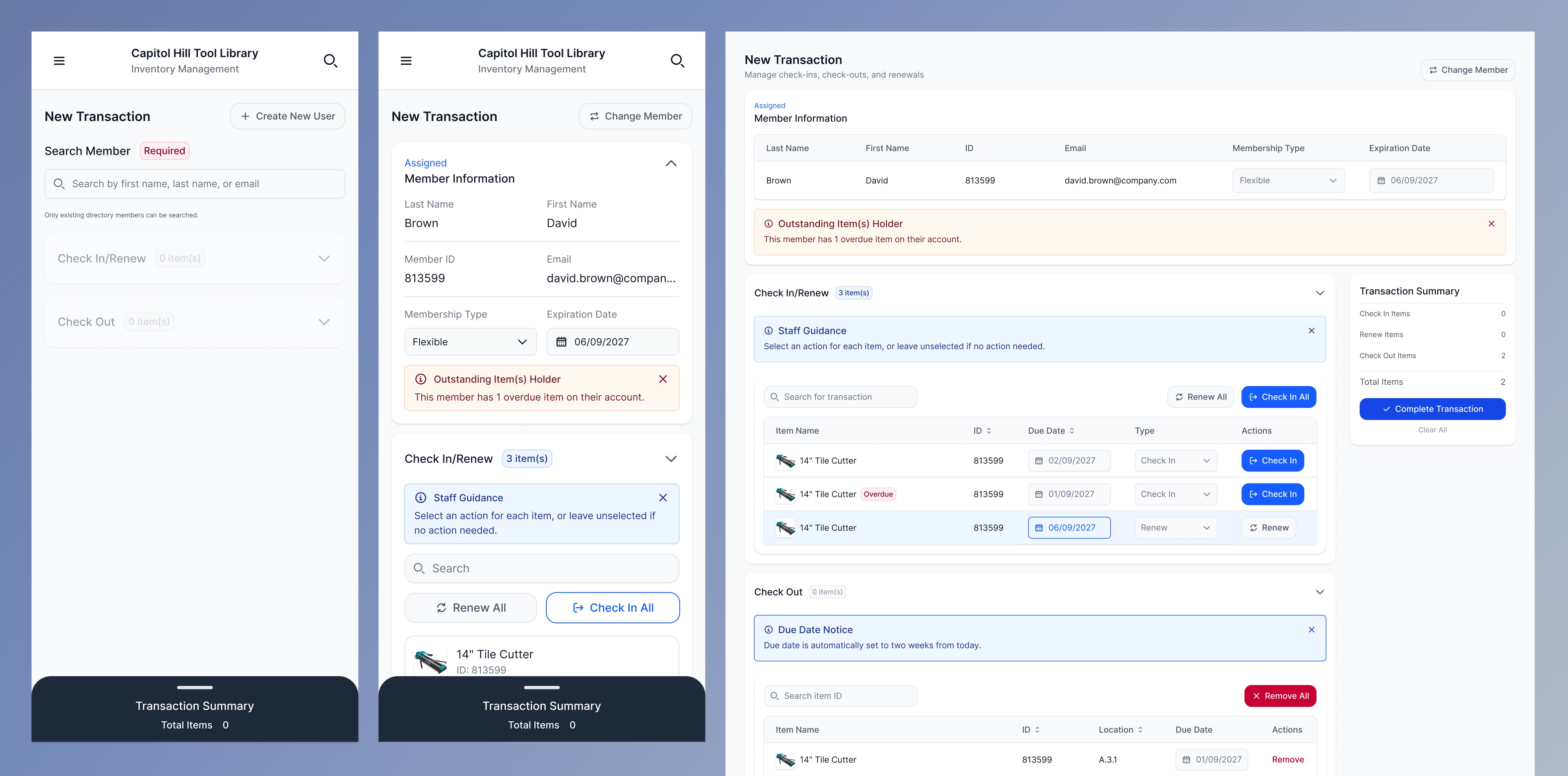
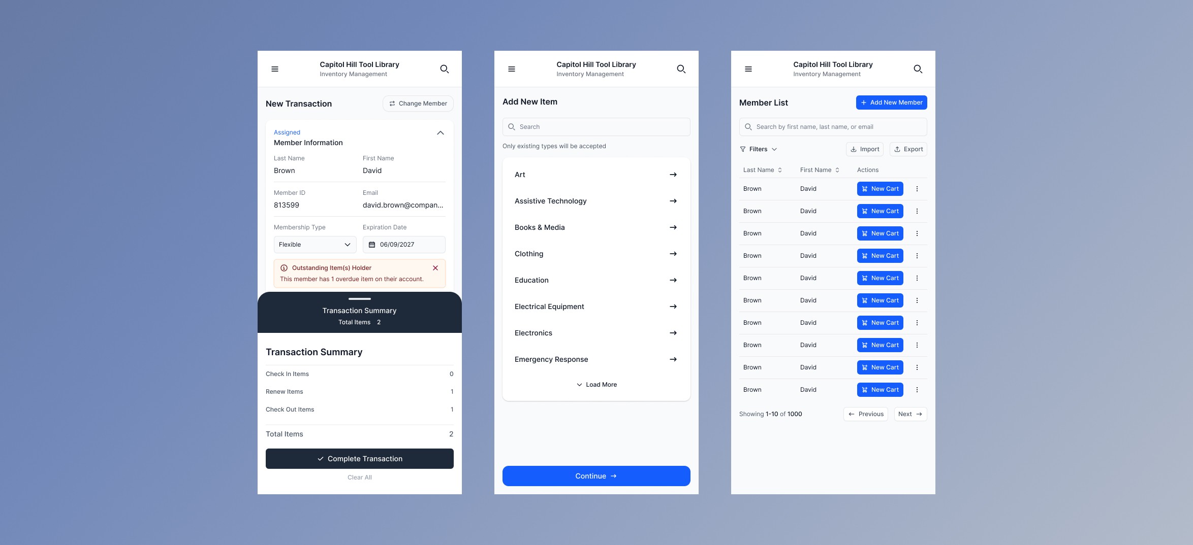
We redesigned transactions into one connected workflow where volunteers could select a member, review active loans, check items in, renew tools, and add new check-outs without jumping between pages.
Workflows
Mobile-first, with clearer feedback
Volunteers often waited for the single check-in computer during busy shifts, so we redesigned the platform mobile-first so multiple people could work at once. We also added clearer confirmation states and persistent transaction visibility, so nobody was left guessing whether something actually went through.
Impact & Outcomes
What I took away
Designing for infrequent users takes extreme clarity, since they can’t rely on familiarity. Systems should guide people rather than rely on memory. And prioritizing simplicity, even over more powerful features, is usually what actually improves usability.
Reflection
What’s next
Next is expanded usability testing with both new and experienced volunteers, incorporating that feedback, then developer handoff with annotated designs and component documentation.