
Capital Hill Tool Library | Inventory Management
Streamlining Tool Lending For Volunteers
CONTEXT
The Capitol Hill Tool Library (CHTL) is a nonprofit community tool lending organization in Seattle where volunteers manage inventory, member accounts, and tool transactions during active shifts. The existing system, MyTurn, created usability challenges that slowed volunteers down and increased reliance on staff support.
Our team redesigned the lending and inventory management experience to simplify high-frequency workflows like check-in, check-out, renewals, and inventory management. The project focused on reducing cognitive load, improving task clarity, and creating a mobile-first system that supports both experienced and first-time volunteers.
MY ROLE
UX Designer
TOOLS
Figma, Lovable
TIMELINE
Jan 2026 – Present
TEAM
Luke Jin, Vy Nguyen, Ji Min Sung, Yoobin Lee, Nathan Do

THE PROBLEM
During shifts, volunteers needed to move quickly between members, tools, and transactions. Instead, the existing system slowed them down.
Through interviews, contextual inquiry, surveys, and usability testing, we identified several recurring issues:
THE PROBLEM
During shifts, volunteers needed to move quickly between members, tools, and transactions. Instead, the existing system slowed them down.
Through interviews, contextual inquiry, surveys, and usability testing, we identified several recurring issues:
THE PROBLEM
During shifts, volunteers needed to move quickly between members, tools, and transactions. Instead, the existing system slowed them down.
Through interviews, contextual inquiry, surveys, and usability testing, we identified several recurring issues:
High Cognitive Load
Too many options, cluttered layouts, and unclear feedback make it difficult to know what to do next.
High Cognitive Load
Too many options, cluttered layouts, and unclear feedback make it difficult to know what to do next.
Inefficient Workflows
Check-in and check-out require unnecessary steps and lack a clear, intuitive flow.
Inefficient Workflows
Check-in and check-out require unnecessary steps and lack a clear, intuitive flow.
Poor Findability
Search and filters fail to reliably surface the correct items, slowing down tasks.
Poor Findability
Search and filters fail to reliably surface the correct items, slowing down tasks.
Weak Onboarding
The system assumes prior knowledge and does not support first-time or infrequent volunteers.
Weak Onboarding
The system assumes prior knowledge and does not support first-time or infrequent volunteers.
Mobile Constraints
Designed for desktop, the experience does not adapt well to fast, mobile-first environments.
Mobile Constraints
Designed for desktop, the experience does not adapt well to fast, mobile-first environments.
Therefore we asked,
How might we enable volunteers (new and experienced) to complete check-in, check-out, and inventory tasks quickly and accurately with minimal staff support?
Therefore we asked,
How might we enable volunteers (new and experienced) to complete check-in, check-out, and inventory tasks quickly and accurately with minimal staff support?
Therefore we asked,
How might we enable volunteers (new and experienced) to complete check-in, check-out, and inventory tasks quickly and accurately with minimal staff support?
SOLUTION
We Focused on Simplifying the Workflows Volunteers Used Most Often.
Check-In, Check-Out, Renewals, Inventory Search, and Member Management
SOLUTION
We Focused on Simplifying the Workflows Volunteers Used Most Often.
Check-In, Check-Out, Renewals, Inventory Search, and Member Management
SOLUTION
We Focused on Simplifying the Workflows Volunteers Used Most Often.
Check-In, Check-Out, Renewals, Inventory Search, and Member Management
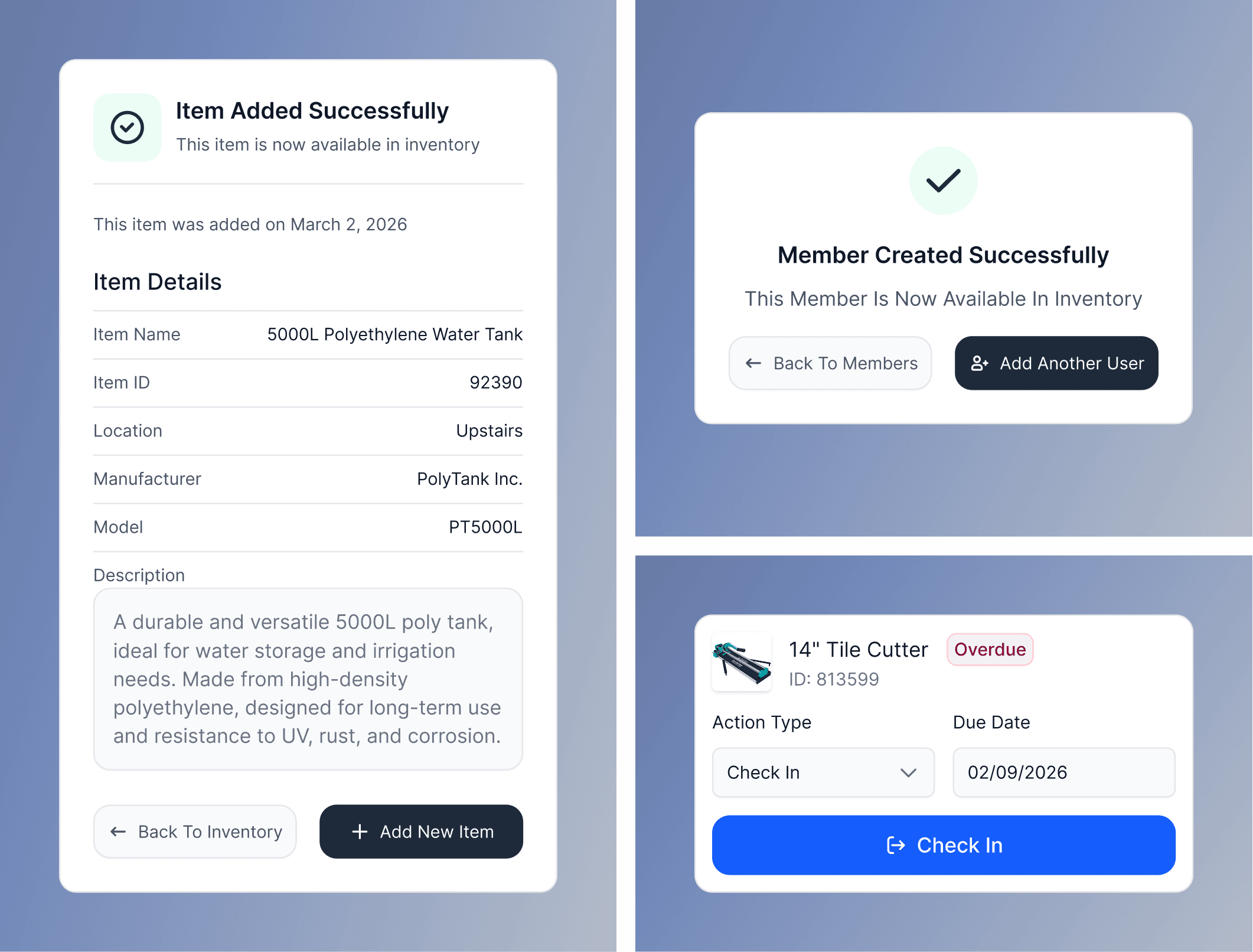
Check-In / Check-Out
We redesigned transactions into one connected workflow where volunteers could select a member, review active loans, check items in, renew tools, and add new check-outs without jumping between pages.
Check-In / Check-Out
We redesigned transactions into one connected workflow where volunteers could select a member, review active loans, check items in, renew tools, and add new check-outs without jumping between pages.
Check-In / Check-Out
We redesigned transactions into one connected workflow where volunteers could select a member, review active loans, check items in, renew tools, and add new check-outs without jumping between pages.
Mobile-First Design
Volunteers often waited for access to the single check-in computer during busy shifts, slowing down transactions and limiting how many members could be helped at once. To reduce this bottleneck, we redesigned the platform mobile-first so multiple volunteers could complete transactions simultaneously from phones or shared devices.
Improved System Feedback
To address the lack of system feedback identified during research, we introduced clearer confirmation states, stronger selected-state styling, and persistent transaction visibility throughout the platform. These changes helped reduce uncertainty during check-in and check-out workflows, prevented duplicate actions, and gave volunteers clearer feedback about what had successfully completed and what still required attention.
TEAM ROLES
Roles, Responsibilities & Workflow
TEAM ROLES
Roles, Responsibilities & Workflow
TEAM ROLES
Roles, Responsibilities & Workflow
As a team, we:
As a team, we:
Audited the existing system (MyTurn)
Identified usability gaps and workflow breakdowns
Defined a focused MVP scope
Prioritized high-impact tasks (check-in/out + inventory)
Iterated on solutions through collaborative design
I focused on translating research into a clear, usable interface:
Led the UX redesign of core workflows
Defined a task-based interaction model
Improved content hierarchy and labeling
Designed a mobile-first interface
Proposed scalable system structure for future development
Led the UX redesign of core workflows
Defined a task-based interaction model
Improved content hierarchy and labeling
Designed a mobile-first interface
Proposed scalable system structure for future development
TAKEAWAYS
From this project, I learned:
TAKEAWAYS
From this project, I learned:
Designing for infrequent users requires extreme clarity
Infrequent volunteers can’t rely on familiarity, so the interface must be immediately understandable with clear actions, labels, and flows.
Designing for infrequent users requires extreme clarity
Infrequent volunteers can’t rely on familiarity, so the interface must be immediately understandable with clear actions, labels, and flows.
Systems should guide users, not rely on memory
Users shouldn’t have to remember steps or rules, well-designed systems provide structure and direction to prevent mistakes.
Systems should guide users, not rely on memory
Users shouldn’t have to remember steps or rules, well-designed systems provide structure and direction to prevent mistakes.
Prioritizing simplicity improves usability
Focusing on clarity and removing unnecessary complexity makes tasks easier to understand, faster to complete, and less prone to error.
Prioritizing simplicity improves usability
Focusing on clarity and removing unnecessary complexity makes tasks easier to understand, faster to complete, and less prone to error.
NEXT STEPS
What's Next?
NEXT STEPS
What's Next?
Expanded Usability Testing
Conduct task-based testing with both new and experienced volunteers to validate efficiency, clarity, and independence in real workflows.
Expanded Usability Testing
Conduct task-based testing with both new and experienced volunteers to validate efficiency, clarity, and independence in real workflows.
Refinement
Incorporate feedback to improve hierarchy, guidance, mobile responsiveness, and address edge cases uncovered during testing.
Refinement
Incorporate feedback to improve hierarchy, guidance, mobile responsiveness, and address edge cases uncovered during testing.
Developer Handoff
Deliver annotated high-fidelity designs, user flows, and component documentation to support smooth and scalable implementation.
Developer Handoff
Deliver annotated high-fidelity designs, user flows, and component documentation to support smooth and scalable implementation.
Post-Implementation Validation
Evaluate performance in real shift environments by measuring task time, error rates, and staff intervention, then iterate based on findings.
Post-Implementation Validation
Evaluate performance in real shift environments by measuring task time, error rates, and staff intervention, then iterate based on findings.
MORE PROJECTS


